The Centre Pompidou
‘The artworks that inspired me were all about simplicity and reduction.’
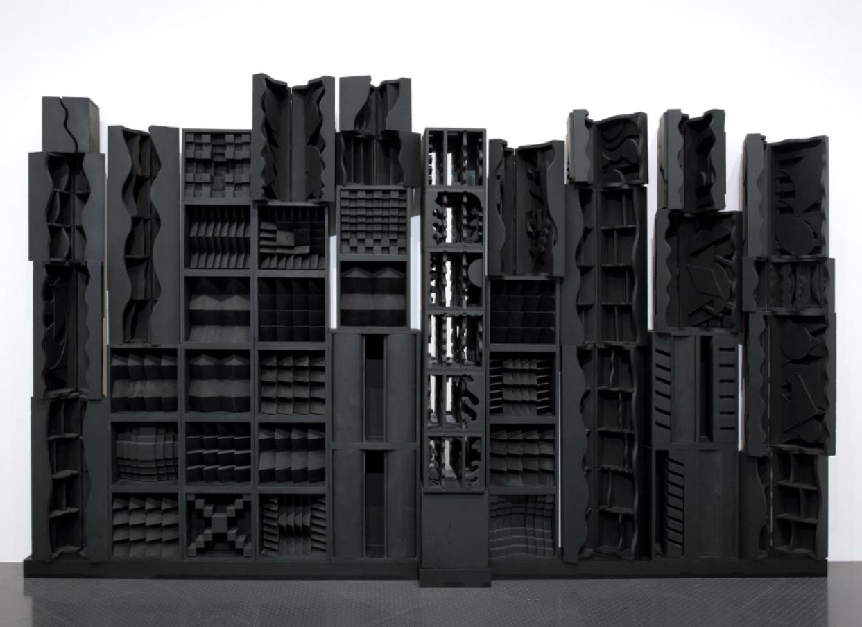
I have always been drawn to the work of Louise Nevelson. As a collector of curiosities myself, her assemblages of objects and sectioned boxes appeal to my nature. However, it is the unity of the black colour throughout that brings coherence and simplicity to the piece allowing to concentrate on the peaceful variety of form.
Of course each of the forms and objects suggest a personal history, but it’s the subtle interplay of light and shadow that reminds me of traditional Japanese architecture and other wooden constructions. I’m drawn to the warmth and texture of these dark surfaces and the calm nature of materials.
Louise Nevelson, Reflexions of a Waterfall, 1982
‘I’m not normally interested in such minimal pieces to this extent, but this colour really does have magical and spiritual qualities.’
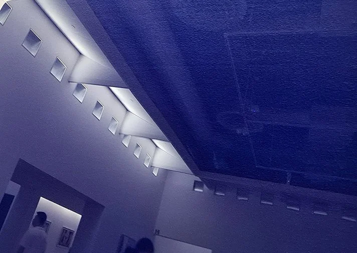
Equally fascinating was IKB 3, Blue Monochrome, 1960 by Yves Klein. Once again it’s the tactile quality of the surface coupled with the intensity of the colour that draws you in.
Yves Klein, IKB 3, Blue Monochrome, 1960
Of course due to the fragile nature of the pigment used the piece is enveloped in a protective glass casing. This means that the reflection of the gallery can be quite distracting, though at times creates interesting illusions.
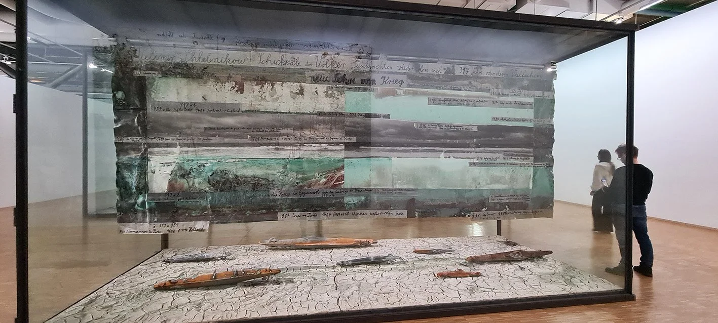
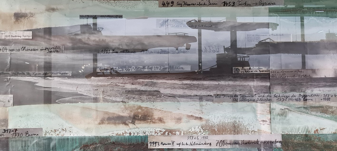
Kiefer mixed media collages suggest a chronology amplified by the natural processes and patinations of the rust.
For Velimir Chlebnikov: The New Doctrine of War, 2013-18, Anselm Kiefer
The layering of photography with lead, paint and text develops a sense of narrative and importance and the colours are stunning. You have to go searching for meanings, though images of world events are never far from the mind. Here though there is a reverence and stillness amongst the chaos.
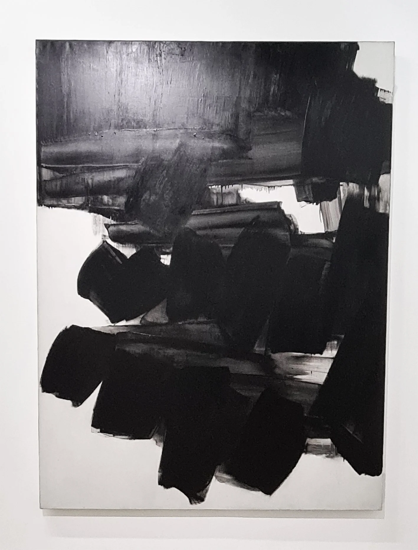
Pierre Soulage,
Painting 260x202cm, 19 June 1963
Pierre Soulage’s large graphic paintings reminiscent of huge inky calligraphic brushstrokes carry a powerful story of the movement and motion in creating them. These are not flat strokes however as the thick paint develops subtle textures and reliefs that give the paintings an added physicality.
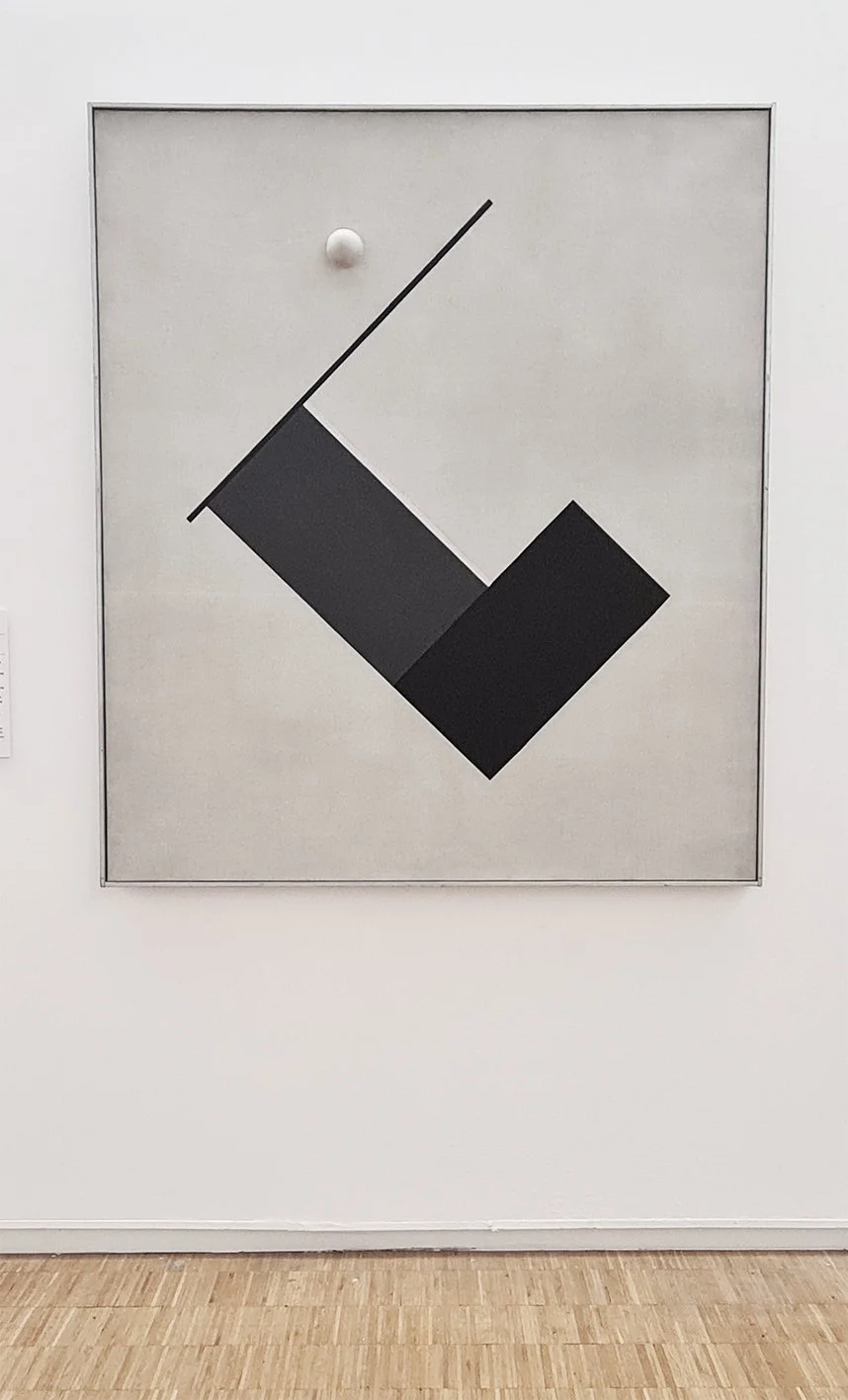
Friedrich Vordemberge-Gildewart, Composition No.24, 1926
From the expressive to the formal. Both using only black and white, but so different in emotion, action and calm. Seems advanced in thinking given it’s time, but part of the wave of experimentation and exploration of new materials in construction and philosophical, social and scientific developments.
Raymond Hains, Les Nympheas, 1961
A 60’s riposte to Monet’s most famous works with fragmented, urban remnants the momentary flowers in this piece.
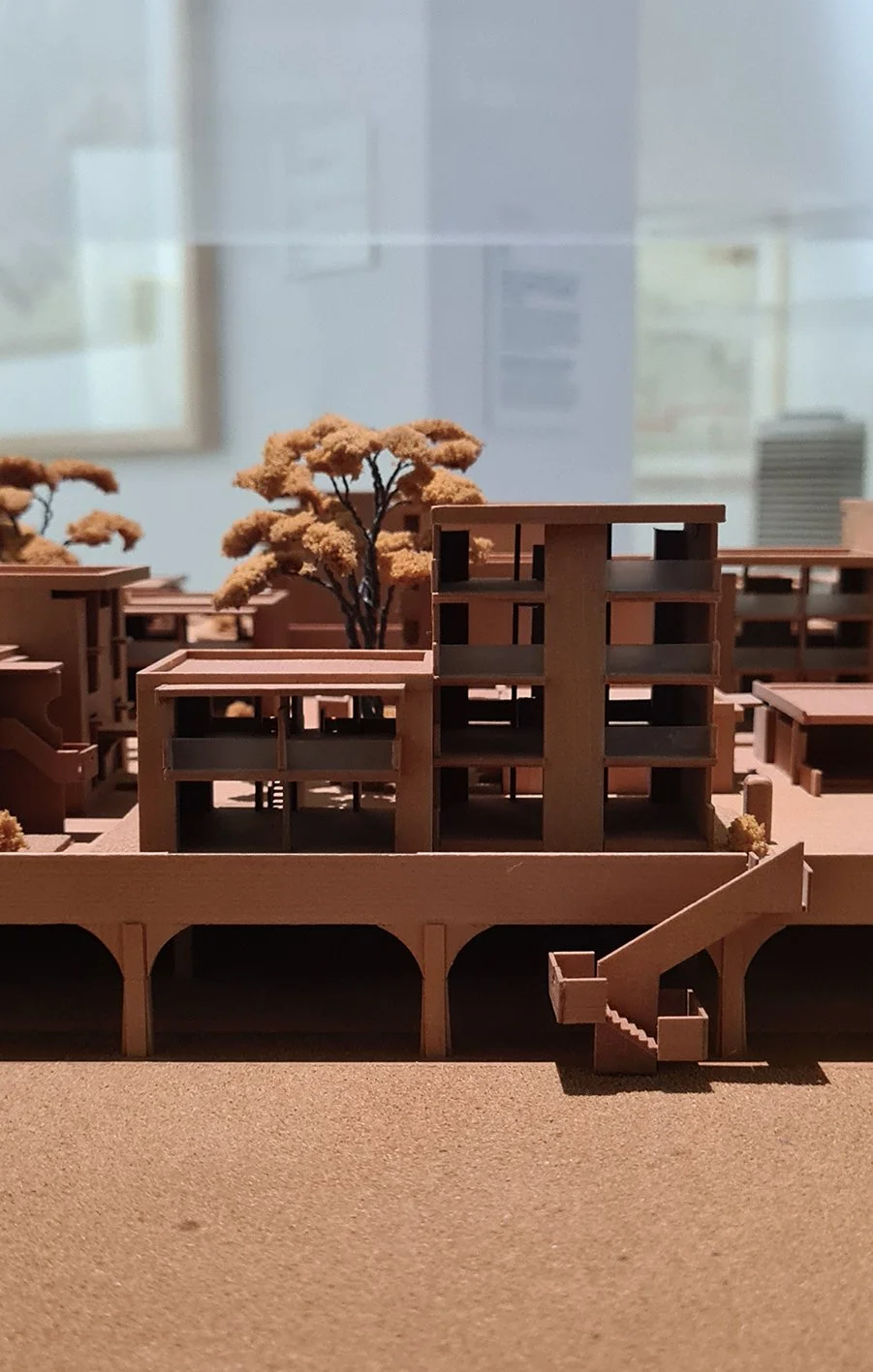
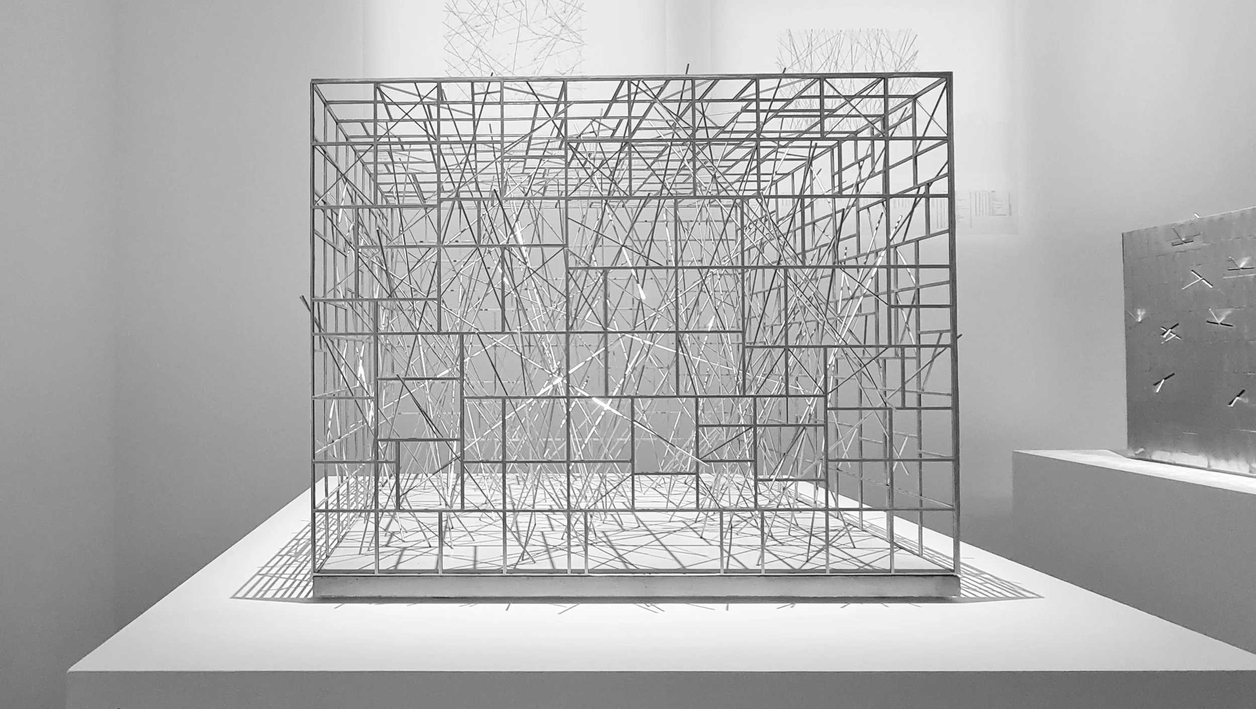
Of most interest to me though was the range of architectural design work in the International Modernities 1960-70 gallery. This is a fascinating insight into the design process and how different drawing styles can be used to visualise and experiment with ideas. There were some beautifully hand crafted models using traditional materials such as cardboard, wood and metal with the introduction of new materials of the time such as Perspex. Interesting to note the presence and atmosphere of wood veneer versus the more functional cardboard landscaping and constructions. This period of Architecture is something that really inspires our own work and generates so many ideas for the future.
Kenzo Tange, Maquette de rendu, (1913, Japon - 2005, Japon) 1961 - 1966.
Michel Andrault, Pierre Parat, Maquette, 1970 - 1973
Nicolas Schoffer, Gouaches relatives au projet de La Tour cybernétique de La Défense (Chronos 4), 1970
4. René Gagès, Facades, 1970
5. Still taken from film in The Centre Pompidou.
6. Masato Otaka, (1923, Japon - 2010, Japon) Complexe d'habitations, Sakaide, Japon, 1968

